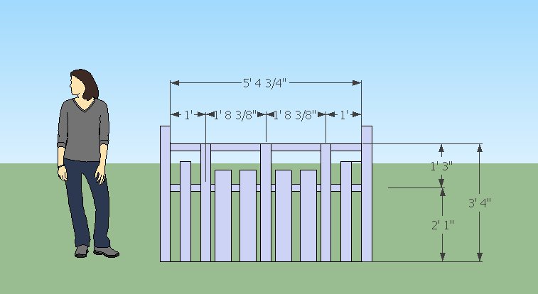
 Very flat, 2D, mockup for fence design #2. This one is closer to what I want. Next up:
- Spacing on the 2×6 slats needs to be cleaned up
- Short 2×4 slats might be swapped for 2×6 slats of same height to make the spacing on the short slats more uniform
Picture looks less cool than my previous effort, largely because of the lack of 3d. Doesn’t help that the bottom rail is missing in this diagram and there is no depth on the 4×4 posts on the end.
Got my proportions worked out by approximating the golden ratio for the fence panel width based on a 40″ height, then again on setting the middle rail height and the offsets on the short pickets. Feels better, I’ll probably try another mockup in 3d before I start digging post holes.
